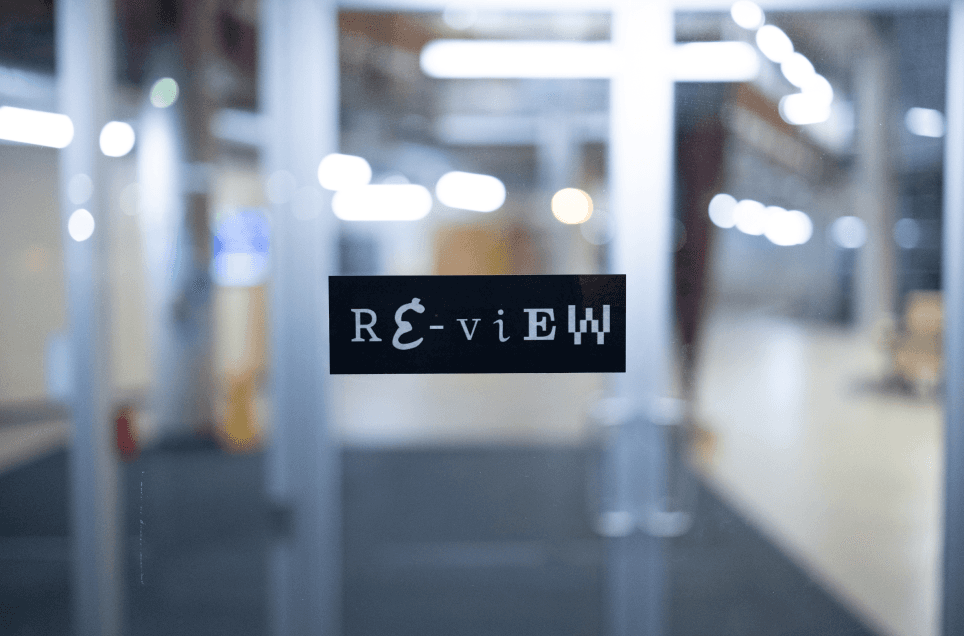
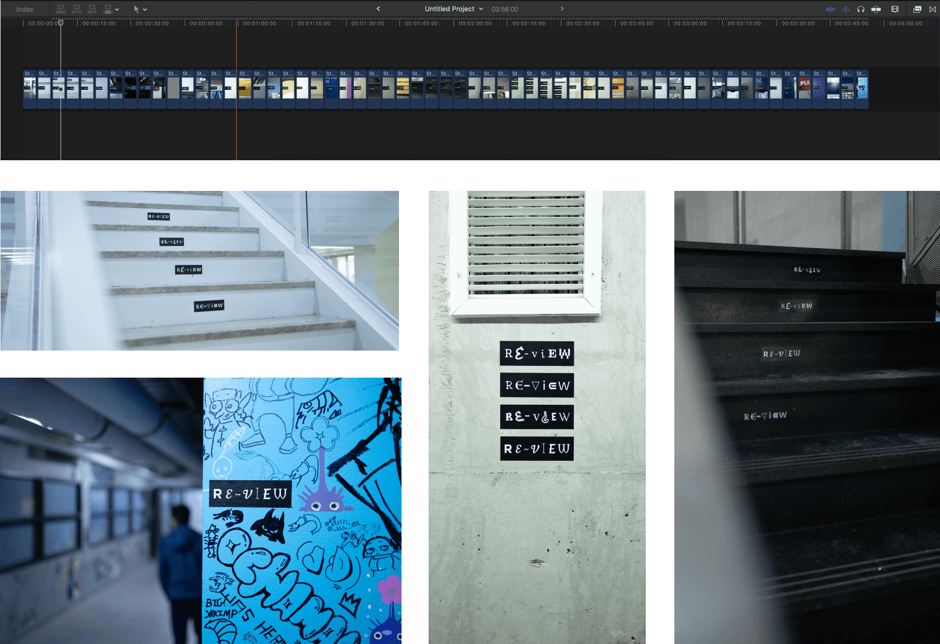
The goal of these stickers was to introduce people to RE-VIEW. When RE-VIEW made appearances again, people would think back to the time they saw RE-VIEW around the school.
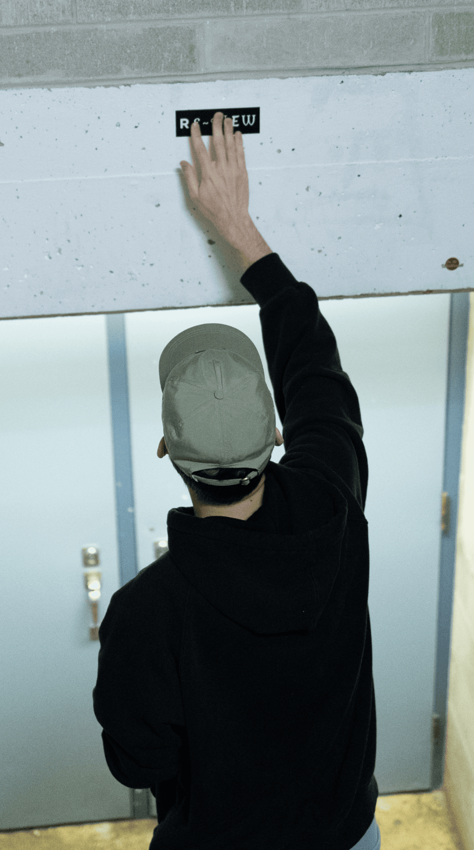
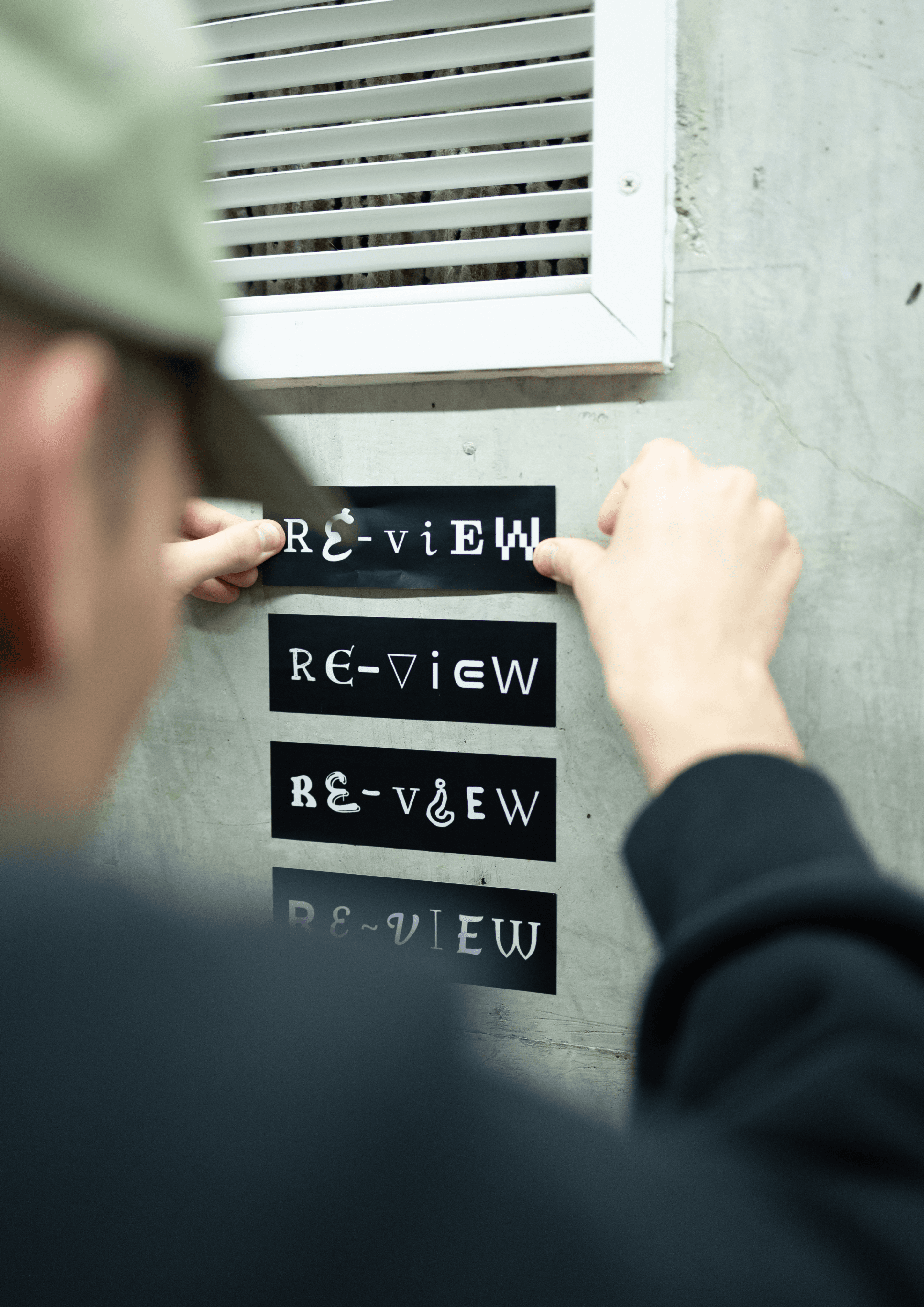
We printed 25x four different sticker types in a 2” x 6” dimension from a local shop called Minuteman Press. We then spent a late night placing 75 stickers around the campus. Repetition and uncanny locations for the stickers is part of what made them memorable. Many have been peeled off, while others will likely remain for years to come.


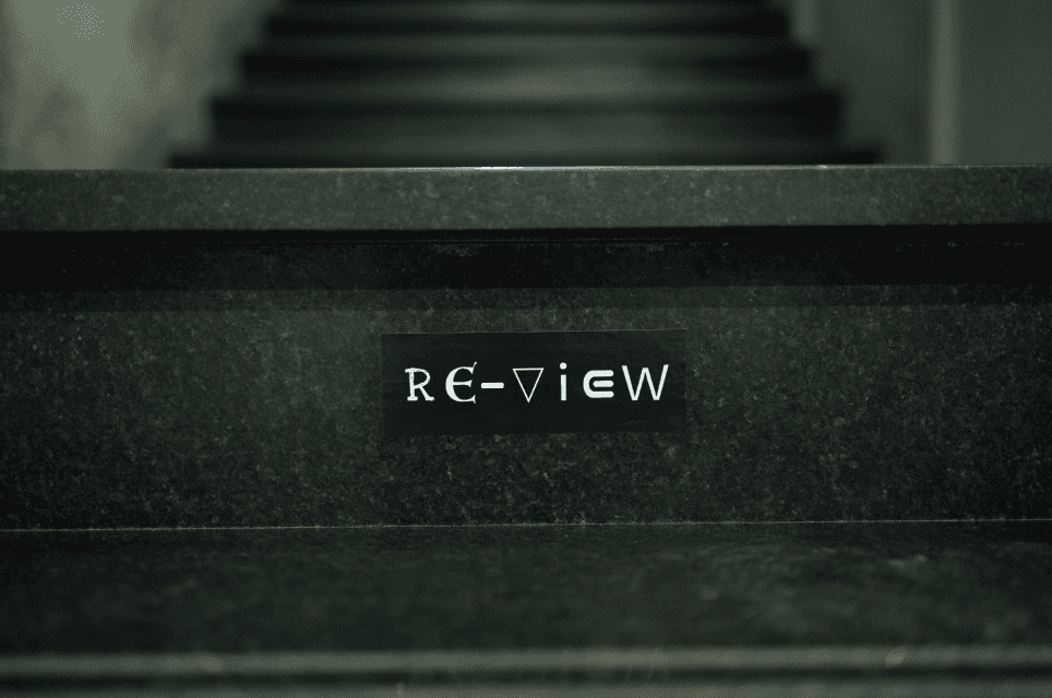
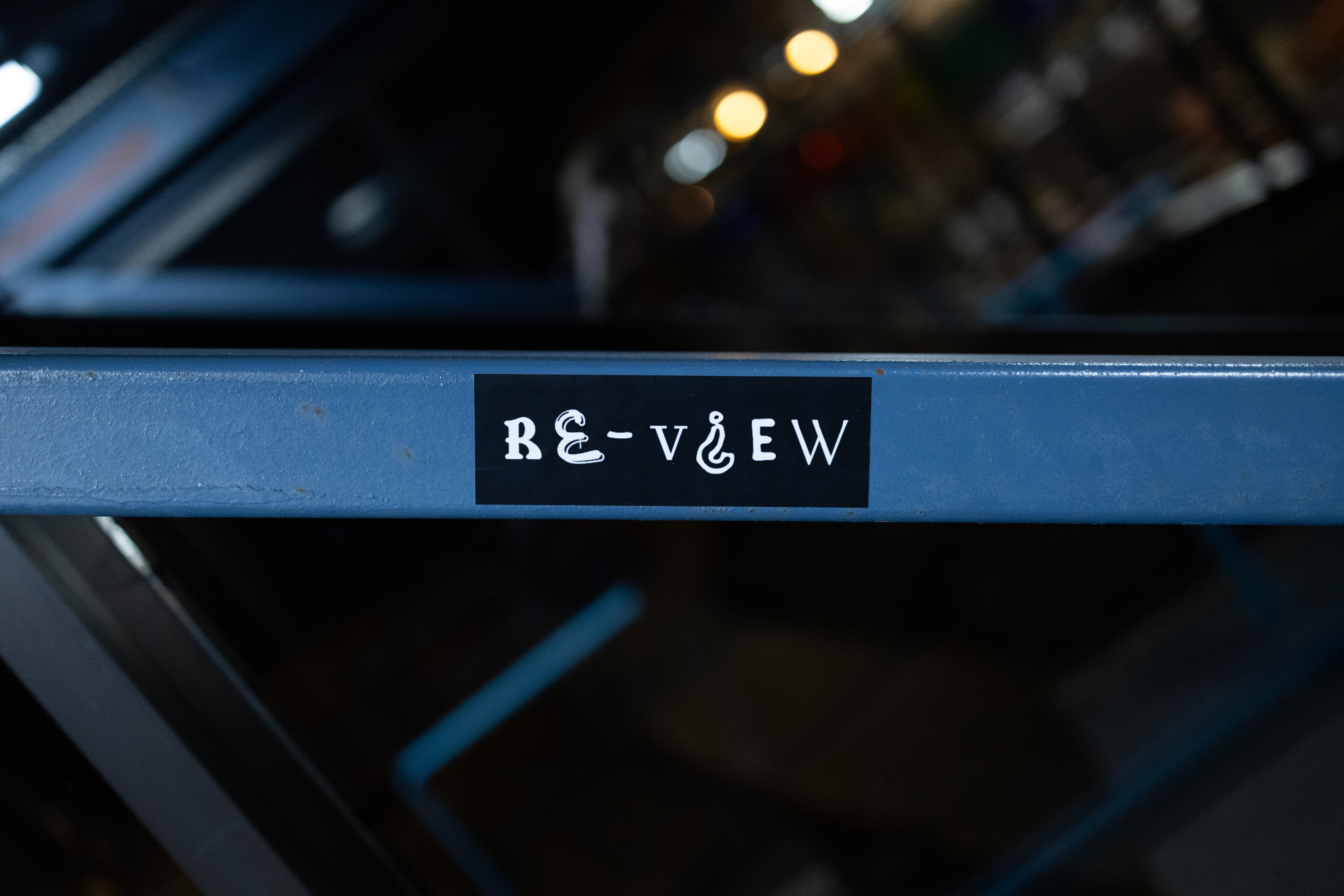
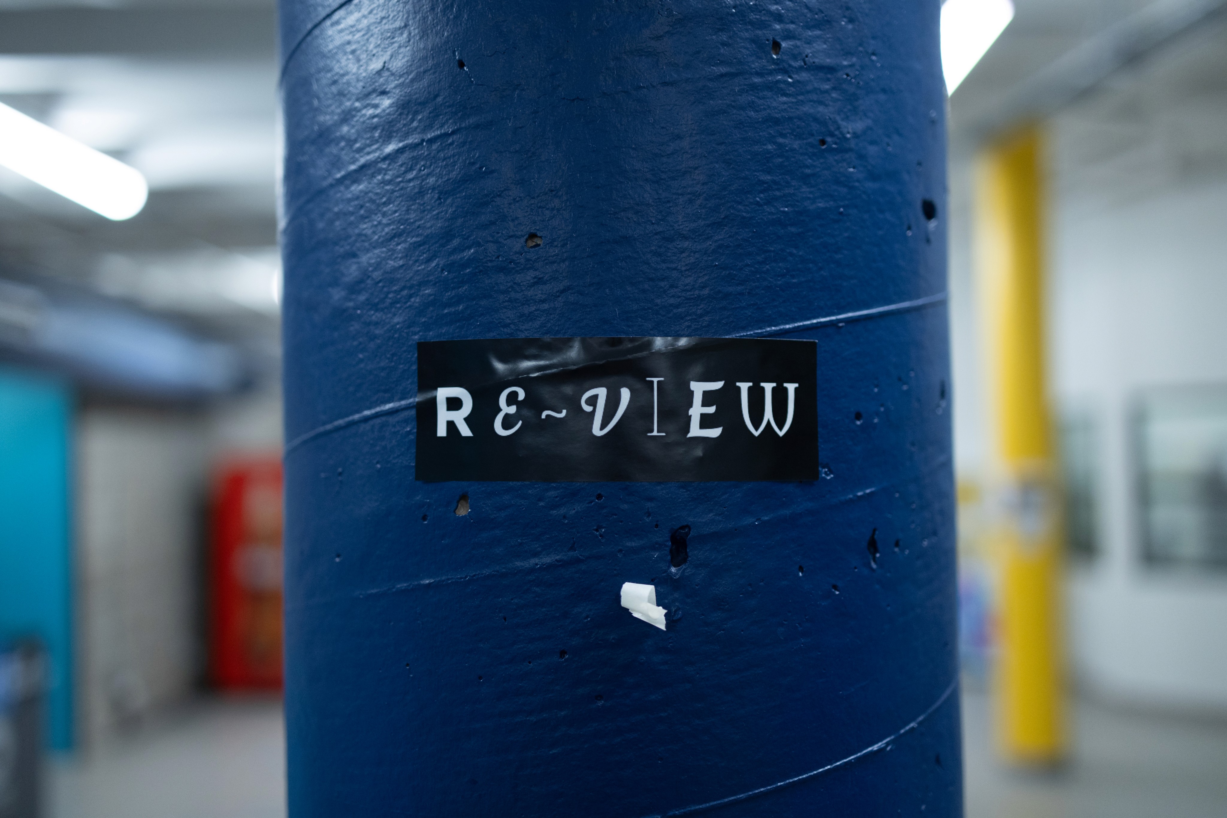

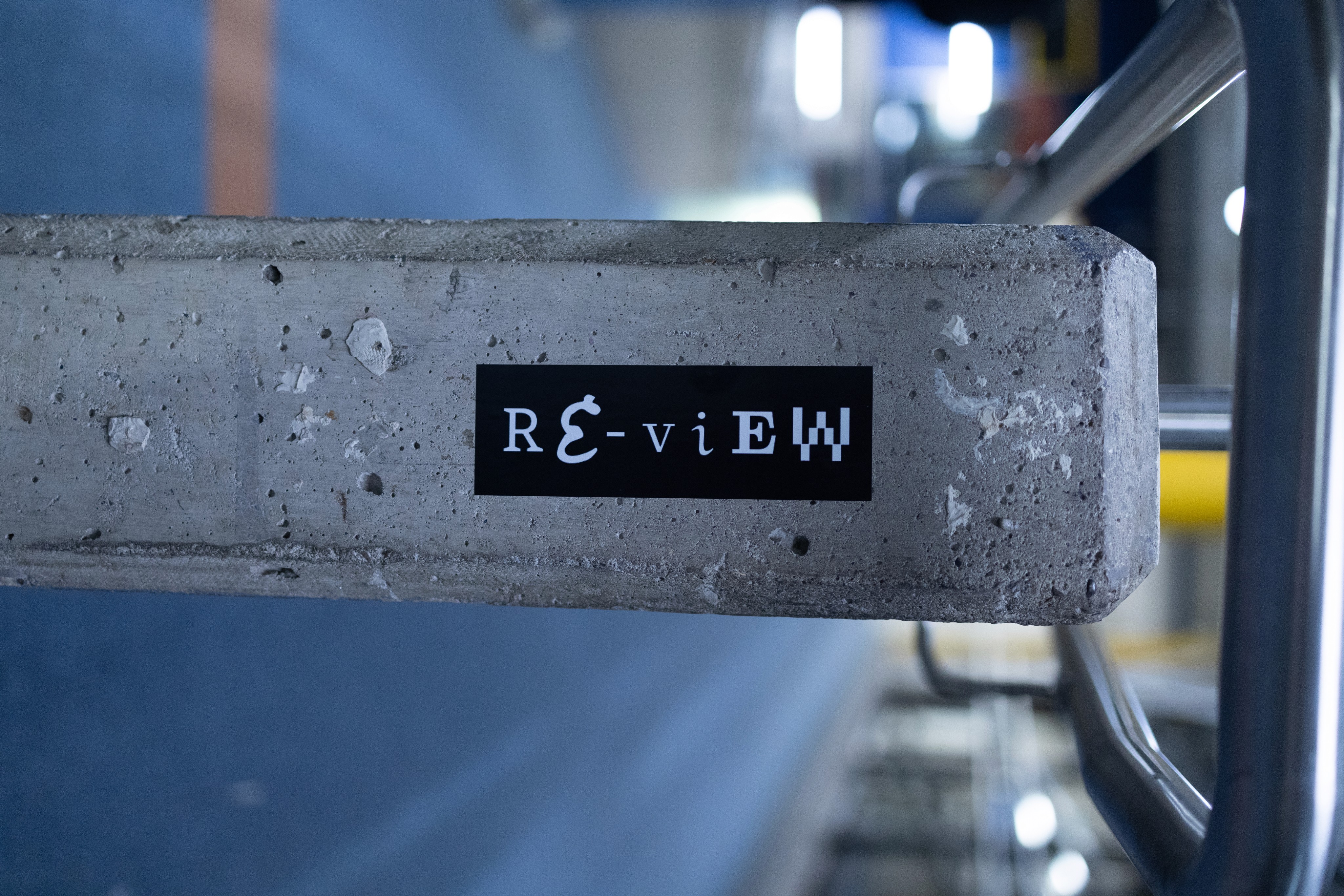

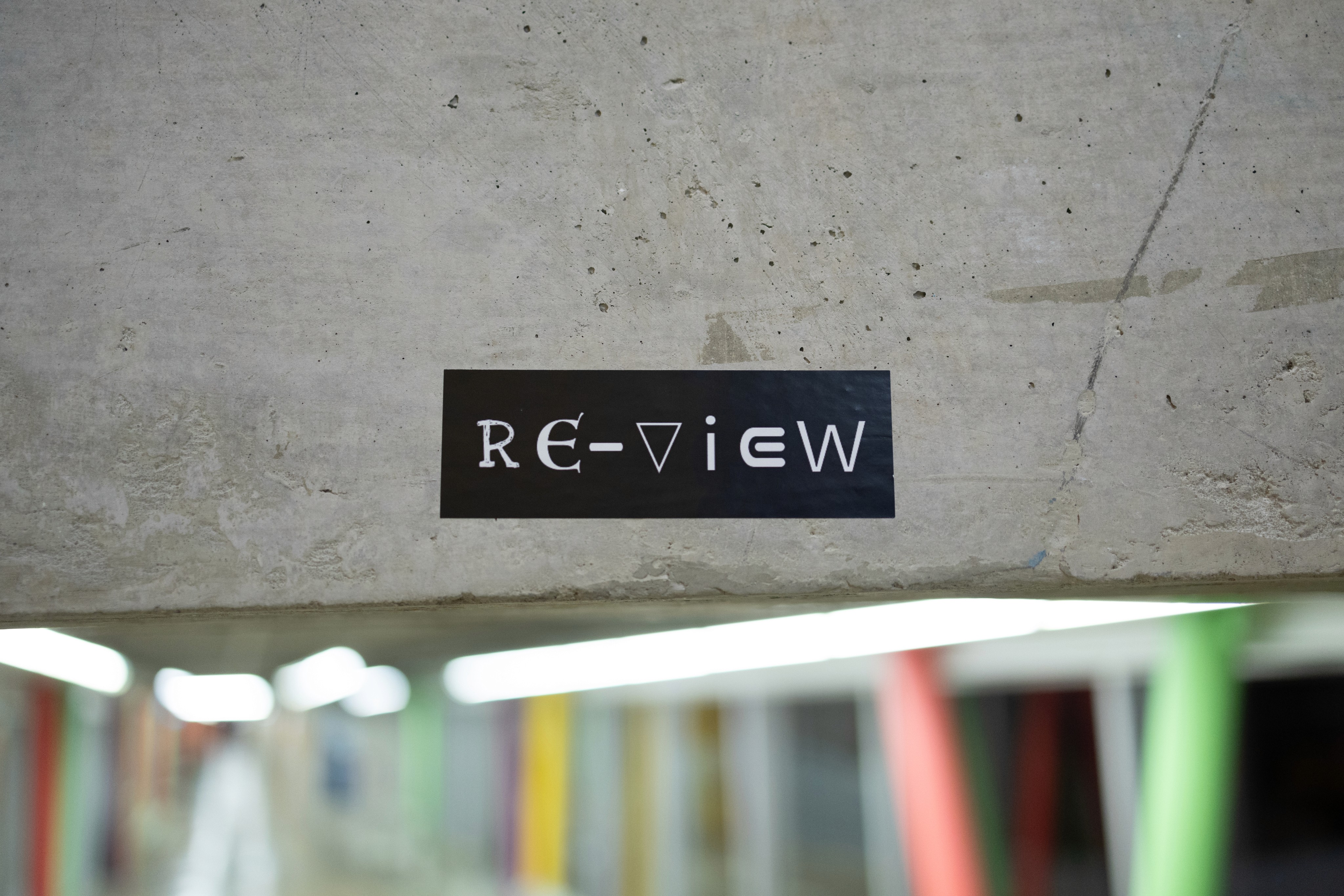
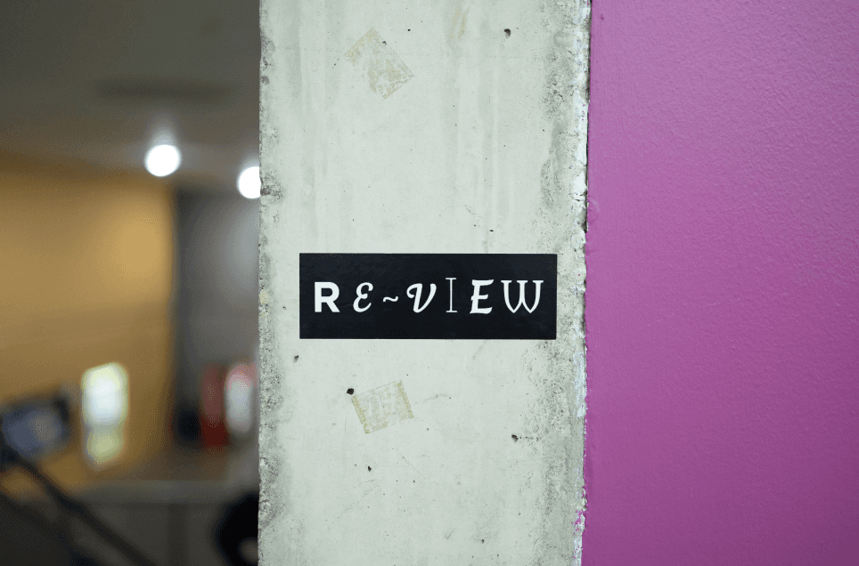
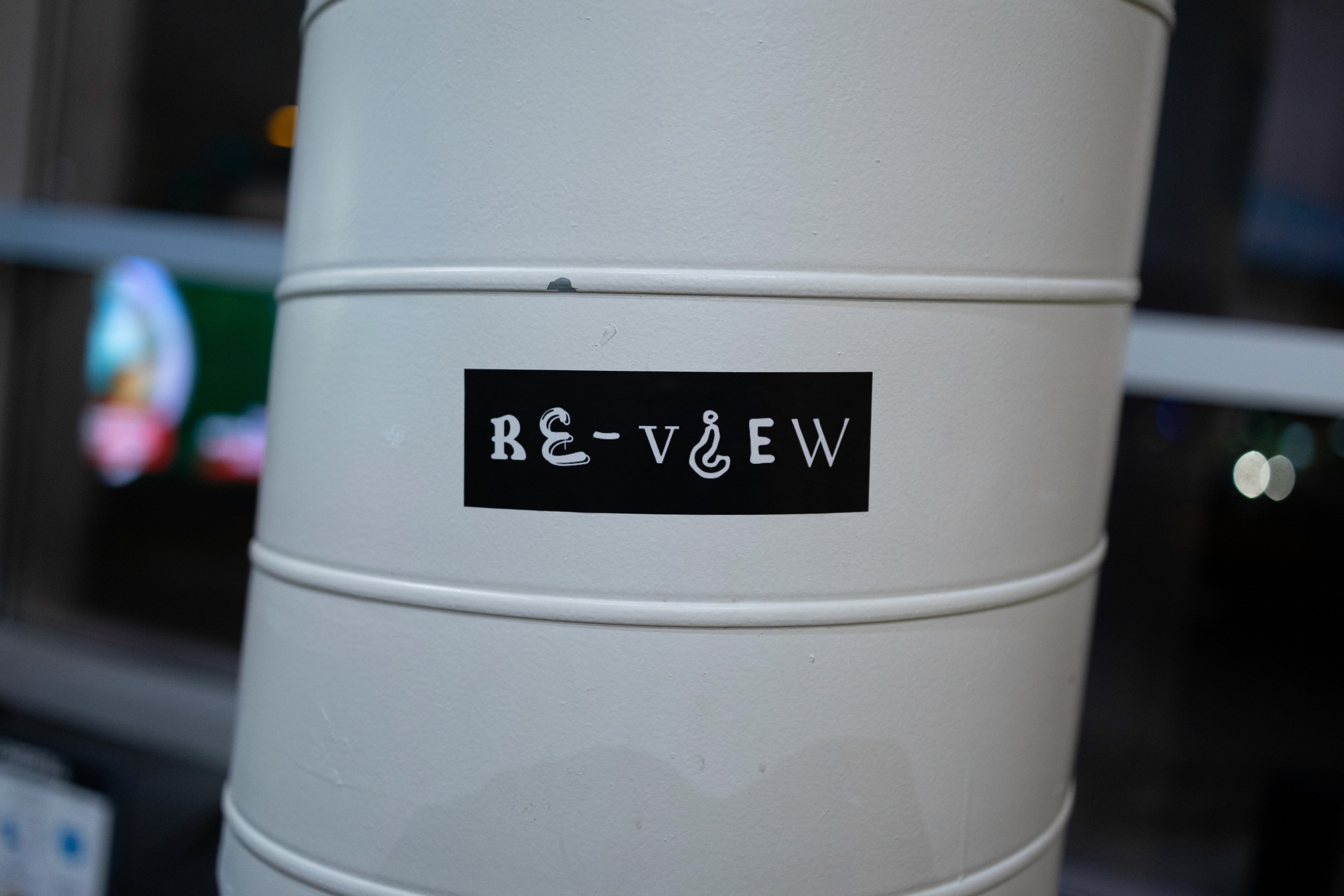
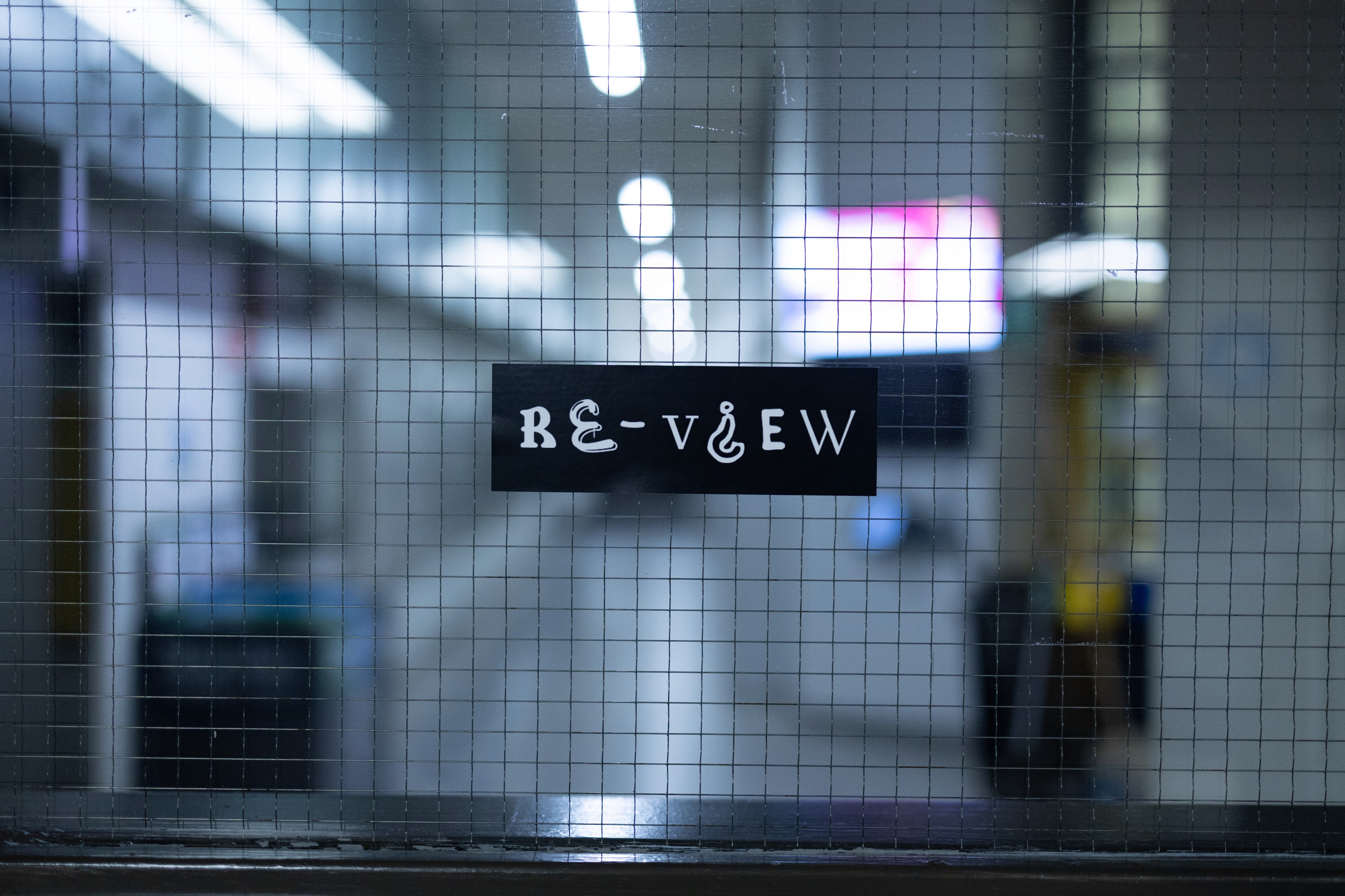
While placing the stickers around school we made sure to take pictures of each from a straight on perspective a few feet away. We could then line each image up in the centre of the video and speed up the frame rate to 12 photos per second to create a high speed cut video of the images.
purpose
A crucial step in tying the narrative together, was the discovery of the website which fully reveals the vision behind RE-VIEW. This step would come at the end of the students journey following RE-VIEW, and would be accessed exclusively on site at a RE-VIEW installation.
dESIGN
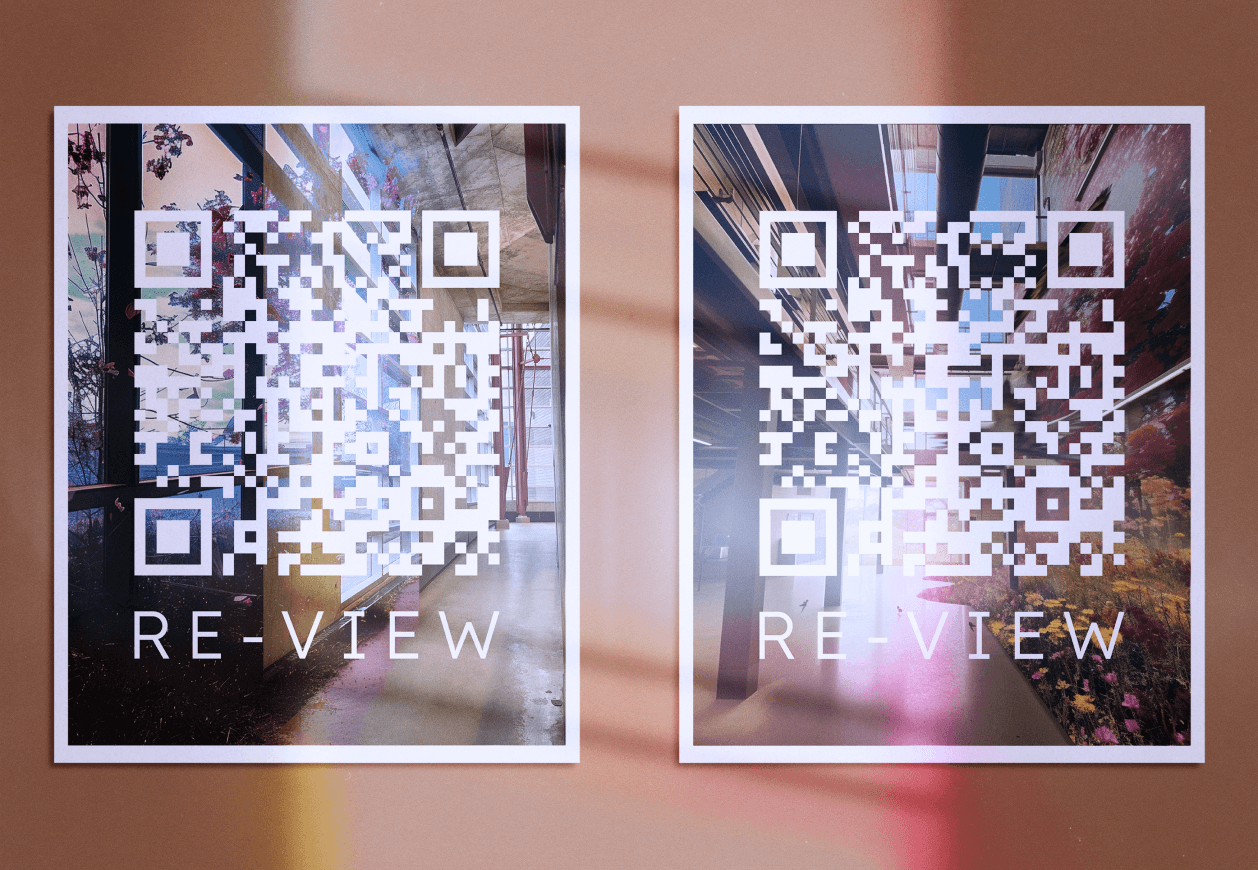
For the design of the QR codes, we opted for a clear design with clear tape overtop for security. They were plastered around the location of our installation for the audience to scan and unveil what RE-VIEW is about.

Problem
Posters had been on the table since the conception of the project however, after the wild success of the stickers we had to re-evaluate some glaring issues. The initial intention was to link to the Instagram which could be used to keep up with RE-VIEW. After assessing the impact of the stickers we realized that the posters would break the feeling of mystery and engagement the stickers had created. The posters would also lack quality because of the poor options for printing available to us. This joined with other posters will make constant competition to our physical artifacts causing people not to look at them.
The final decision was to not print the posters because they would harm the feeling of intrigue and mystery behind RE-VIEW, plus they will likely be disregard from the audience if they see just another poster in campus.
Issue Outcome
The main issue with excluding the posters was that the Instagram would not receive as much attention from students curious about RE-VIEW. Luckily the lack of posters did not harm the final narrative delivery.
The stickers more than made up for the harm of not having the posters. The emphasis on just the stickers built a large feeling of mystery reaching way more people than what was expected.
This issue could have been fixed by making smaller scale, sticker or magnet type posters. These would be harder to remove and work more coherently alongside the stickers. We recognize that also the use of posters would have led to students to have a better connection with RE-VIEW.